Icon Design Trends in 2026
Icon design in 2026 is ditching generic minimalism for custom, personality-driven sets with subtle 3D, motion, and actual brand storytelling.

Okay so I've been diving deep into what's actually happening with icon design this year, and honestly? It's kind of wild how much has shifted. The flat, minimal icon era isn't exactly dead, but it's definitely morphing into something way more interesting.
I spent the past couple weeks researching this, reading through design blogs, checking out what studios are shipping, and honestly just scrolling through way too many Dribbble shots. And yeah, there are some clear patterns emerging. Let me break down what's actually happening in icon design right now.
The Flat Icon Fatigue Is Real
Here's the thing nobody wants to admit out loud: we're all kind of tired of the same generic flat icons. You know the ones I'm talking about. The perfect circles, the 2px strokes, the systematic approach that made everything look... well, the same.
Turns out designers got bored first. And now brands are catching up. The shift isn't about abandoning simplicity entirely. It's more like we're asking "what if icons had personality again?"
The illustrated icon aesthetic from the early 2000s is making a comeback, but it's different now. More intentional. Better executed. Think Yahoo and MSN vibes but filtered through 2026 sensibilities. Modern delivery apps are doing this really well with their food icons. They feel playful and human without looking childish or dated.
Custom Iconography Is Having Its Moment
So this is probably the biggest trend I'm seeing everywhere: custom icon sets. Brands aren't just downloading free icon packs anymore. They're commissioning full custom libraries that actually match their visual identity.
Makes sense when you think about it. Your typography is custom. Your color palette is specific. Why should your icons be the same ones everyone else uses?
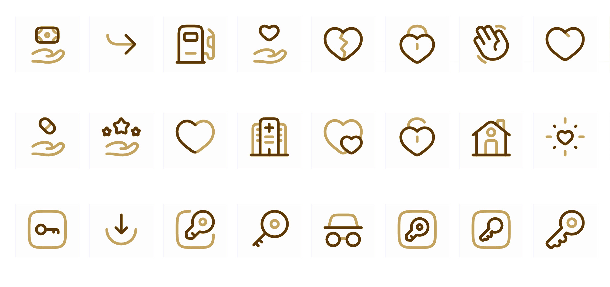
Plus, custom icons solve a practical problem. Generic flat icons lack character. They don't help with brand recognition. When every fintech app uses the same minimalist wallet icon, nobody remembers which one is yours.
The best custom icon work I'm seeing in 2026 has this warmth to it. Illustrated details. Sometimes hand-drawn elements. Colors that actually mean something. Icons that tell a story rather than just marking a button.
What Makes a Good Custom Icon Set?
Okay so based on what I'm seeing from studios doing this well:
- Consistency without monotony - Each icon feels related but has its own character
- Scalability - Works at 16px and 256px
- Cultural specificity - Borrows from the brand's story or origin
- Emotional resonance - Users feel something, even if it's subtle
- Functional clarity - Pretty doesn't matter if nobody understands what it means
The challenge is avoiding generic territory. A leaf icon for sustainability could belong to anyone. But an icon that references a specific pattern from your materials or a contour from your place of origin? That's ownable.
3D Icons Are Everywhere (But Not How You'd Think)
Yeah, 3D icons are huge right now. But we're not talking about the glossy, over-rendered style from a few years back. This is more subtle. More tactile.
The term people keep using is "soft 3D". Think gentle bevels, subtle shadows, surfaces that look almost touchable but don't scream for attention. It's dimensional without being aggressive about it.
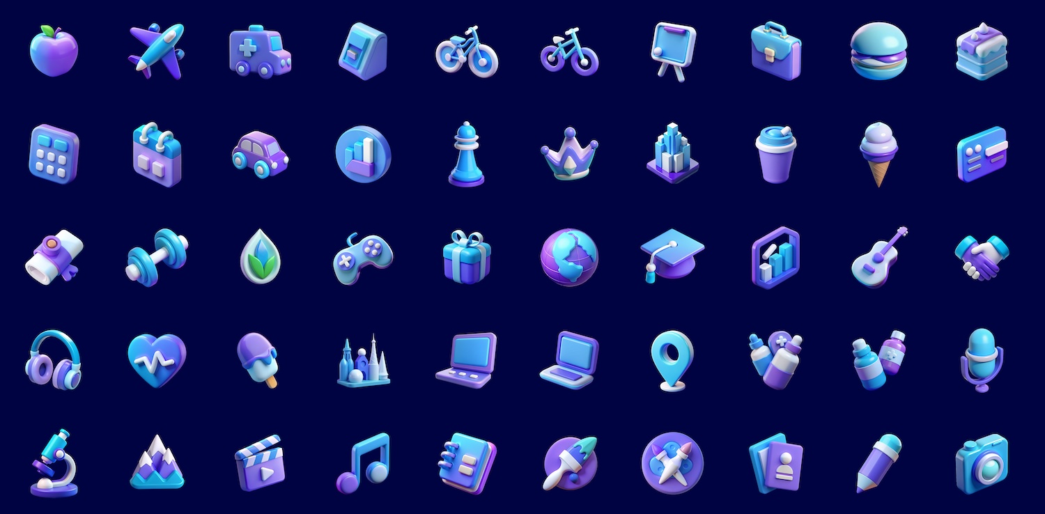
Emma Grant from Figment Agency nailed it when she said these give "a sense of presence and quality that flat marks can't always achieve". There's something about that slight depth that makes icons feel more premium. More considered.
And the best part? They work across contexts. App icons get that tactile quality. Packaging feels more substantial. Digital experiences have more hierarchy. The effect isn't shouting "LOOK I'M 3D" but rather just adding this layer of sophistication.
The Technical Side Nobody Talks About
Creating 3D icons that actually scale is harder than it looks. You're dealing with lighting that needs to work at multiple sizes. Shadows that can't get muddy when compressed. Forms that read clearly even when tiny. youtube
Designers are using Figma, Blender, Cinema 4D, and honestly just layering 2D shapes with really smart gradient work. Not everything needs to be actual 3D modeling. Sometimes it's about creating the illusion of depth through color and shadow. youtube
Glassmorphism Icons: Still Going Strong
Okay I'll admit it, I thought glassmorphism would fade by now. But it hasn't. If anything, it's matured into something more refined.
The frosted glass effect with layered transparency and vibrant colors is working really well for SaaS dashboards and enterprise tools. It brings sophistication without the corporate rigidity that dominated for so long.
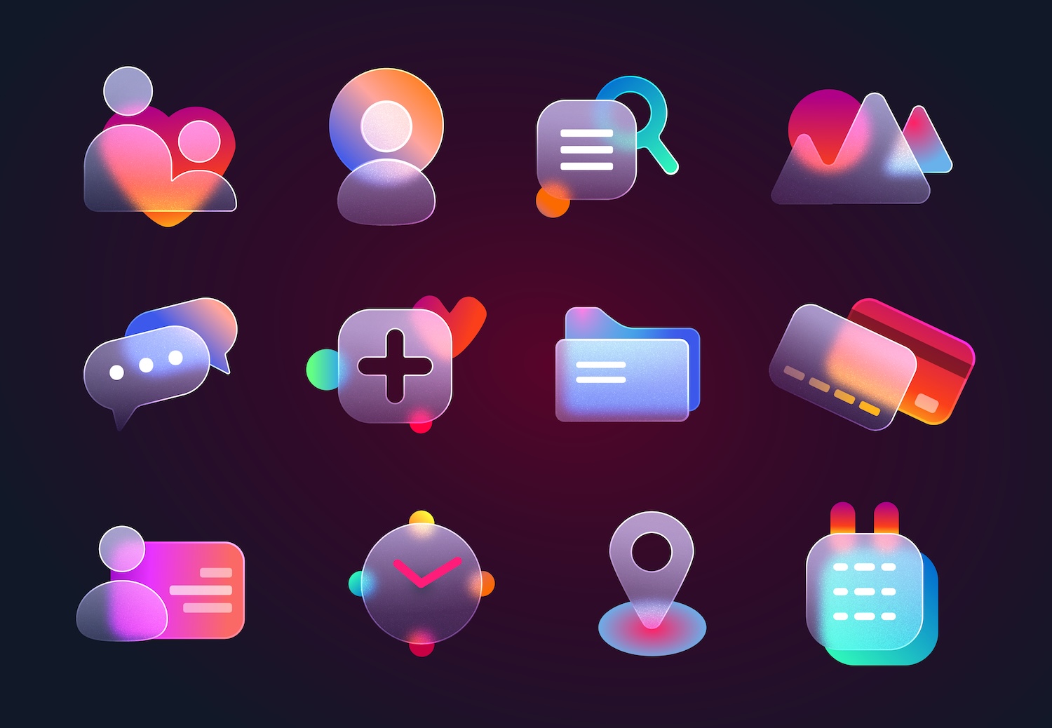
What's changed is the execution. Early glassmorphism was kind of... much. Too many layers, too many effects, readability issues everywhere. The 2026 version is calmer. Cleaner edge definition. Better contrast management. Actually thinking about accessibility. figma
Icons with glass effects are particularly effective for:
- System icons that need to feel premium
- App icons on iOS (works with the Liquid Glass design)
- Dashboard elements where hierarchy matters
- Icons that sit on varying backgrounds
But yeah, you have to be careful. Done wrong, glassmorphism is a UX killer. The transparency can destroy legibility. So the trend now is being more selective about when and where to use it.
Motion Is The New Baseline
Here's something that surprised me: animated icons aren't a special feature anymore. They're becoming expected, especially in digital products.
And I'm not talking about those over-the-top animations that were everywhere in 2018. This is purposeful motion. Micro-interactions that show state changes. Transitions that guide attention. Feedback loops that feel natural.
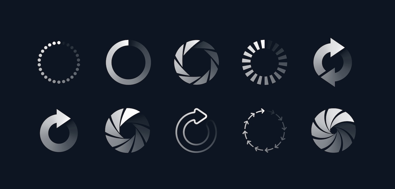
The best motion work I'm seeing does a few things really well:
It respects loading times. Nobody wants a 3-second icon animation when they're trying to complete a task.
It provides feedback. The icon changes to confirm an action or show processing. These are especially effective for buttons and notifications.
It adds personality without distraction. The animation reinforces the brand's character but doesn't pull focus from the actual content.
Tubik Studio calls this "motion design for UX, not showreel". Which honestly is the perfect way to describe it. The goal isn't to go viral on Twitter. It's to make the interface feel more responsive and alive.
Platform-Specific Design Actually Matters Now
So this is something people aren't talking about enough. Both iOS and Android have gotten way more opinionated about how icons should work.
iOS 26 introduced what they're calling "Liquid Glass design". It literally wraps every app icon in layered glass effects with depth, reflections, and light treatments. Which means if your shapes aren't clear and bold, the OS effects can merge everything into mush.
Android 15 is doing something similar with adaptive icons. The system applies masks and automatically tints backgrounds based on the user's theme. Plus there's this whole foreground/background separation requirement that affects how you structure your icon.
Turns out you can't just design one icon anymore and call it done. You need to think about:
- How it survives iOS's glass treatment
- How it works with Android's shaped masks
- Dark mode variants that actually look good
- Multiple sizes from 16px to 1024px
- Accessibility at high contrast settings
And yeah, it's annoying. More deliverables. More edge cases. But the icons that nail all these contexts? They look professional in a way that generic solutions just can't match.
The Adaptivity Challenge
Dynamic logos and adaptive identities are huge in 2026. Over 50% of companies in America and Europe are implementing some form of adaptive branding system.
For icons, this means creating sets that can shift colors for dark mode, simplify for tiny app icon contexts, or even change based on time of day. It's a move from static assets to living systems.
The best example I've seen is brands creating icon "rule books" rather than just icon files. Guidelines for how the system adapts. When to use which variant. How animation principles apply across different contexts.
Typography Is Eating Icon Design's Lunch
Okay this one is controversial but I think it's true: expressive typography is reducing our dependence on icons.
With variable fonts that adapt in real time, type can do things that used to require iconography. Font weight changes with user action. Headlines morph across breakpoints. Text signals emotion before you even read it.
I've noticed more interfaces where the icon is optional. Typography becomes the hero. Bold, distinctive wordmarks replace icon-heavy navigation. Custom letterforms with exaggerated features do the heavy lifting.
This doesn't mean icons are dead, obviously. But it does mean they're competing for attention in ways they didn't have to before. The interfaces that work best in 2026 use icons and typography in this really thoughtful balance. Neither one dominating. Both earning their space.
The Death of the Generic Icon Library
So yeah, there are still thousands of free icon libraries out there. Feather Icons, Lucide, Phosphor, Majesticons. They're all great for prototyping or internal tools.
But for consumer-facing products? For brands that want to be remembered? The generic library approach is looking tired.
The icons people remember in 2026 have specificity. They reference something real. They make choices about style that aren't just "clean and minimal." They take risks with color, form, or concept. I think what happened is everyone realized that icons are part of brand language. You wouldn't use a generic brand voice. So why use generic brand icons?
AI Is Changing Icon Creation (But Not How You'd Think)
Turns out AI isn't replacing icon designers. It's just becoming another tool in the process. Designers are using AI to generate initial concepts, explore variations quickly, or create assets that used to take hours.
The best work happens when you treat AI as a sketch partner. You guide it. Refine it. Add the human judgment that makes something actually good rather than just technically correct.
Plus AI tools are making custom icon sets more accessible. Smaller brands that couldn't afford full custom libraries are now commissioning hybrid workflows. AI generation plus human refinement. It's not perfect but it's democratizing access to better design.
The catch is you have to know what you're doing. AI can generate an icon. It can't tell you if it's the right icon for your context, your users, your brand story. That judgment still requires a designer.
Trends That Are Actually Fading
Not everything is on the rise. Some approaches are losing steam:
Ultra-minimal line icons - Still functional but forgettable Strictly monochrome sets - Color is back in a big way Perfectly geometric grid systems - Organic shapes are winning One-size-fits-all approaches - Context-specific design matters more
The shift feels like design is moving from systematic perfection toward intentional imperfection. Icons that feel handmade. Slightly off-grid. Human.
What Actually Works in 2026
After looking at all this, here's what I think makes icon design effective right now:
Personality Over Perfection
Icons don't need to be flawless. They need to be memorable. A slightly rough edge or unexpected color choice makes something stick in your brain.
Context Over Consistency
Yeah, consistency matters. But adaptability matters more. Icons need to flex across platforms, sizes, and use cases while maintaining their core identity.
Story Over Symbol
The best icons reference something specific. They tell a micro-story about the brand, the product, or the action. Generic symbols are just... there.
Motion Over Static
If it's digital, it probably should move. Even subtle animation adds life and feedback that static icons can't provide.
Warmth Over Clinical
Cold precision is out. Icons that feel human, approachable, even slightly imperfect are connecting better with users.
The Bigger Picture
So what's really happening here isn't just about icon trends. It's about design rejecting the corporate minimalism that dominated the 2010s. We're seeing warmth return. Personality. Risk. The willingness to make choices that might not appeal to everyone but deeply resonate with someone.
Icons are part of that shift. They're moving from functional markers to brand storytelling devices. From systematic perfection to expressive tools. From afterthoughts to considered elements that deserve real creative attention. And honestly? It's making the internet more interesting to look at. More human. More varied.
Practical Recommendations
If you're working on icons right now, here's what I'd suggest:
Start with strategy, not style - Why does this icon exist? What should it communicate? How does it fit the larger brand system?
Test across contexts early - Don't just design at one size or on one background. See how it works in dark mode, at 16px, on photography, in motion.
Consider custom before free - Generic libraries are fine for prototyping. But if this is customer-facing, invest in owning your visual language.
Think systems, not sets - Create rules and principles, not just individual icons. How does the system adapt? When does complexity increase or decrease?
Balance craft with technology - Use AI where it helps. Use hand-drawing where it adds character. Use vector tools where precision matters. Mix approaches.
Design for accessibility - High contrast modes, screen readers, colorblind users. If your icons only work in ideal conditions, they don't actually work.
Looking Forward
I think icon design in 2026 is in this interesting transitional moment. We haven't fully committed to any single aesthetic. The best work is mixing approaches.
3D but subtle. Illustrated but functional. Animated but purposeful. Custom but scalable.
What comes next probably depends on how AR/VR interfaces develop. Spatial UI is starting to require icons that work in three-dimensional environments. That'll push the craft in new directions.
But for now? The opportunity is in specificity. Icons that are unmistakably yours. That tell your story. That add value beyond just marking a button.
The generic icon era gave us efficiency and consistency. Which was useful. But I think we're all ready for something with more flavor. More personality. More human.
And based on what I'm seeing from studios and brands in early 2026, that's exactly where we're headed.