Pixel-Perfect Design Is Dead. Fluid Design Won. Here's What That Means.
Container queries, fluid typography, and intrinsic layouts have replaced rigid breakpoints. A practical guide to fluid design in 2026 and why it changes everything.

I need to tell you something that might sting a little. That Figma file you spent three days perfecting at exactly 1440px wide? With every element positioned to the pixel? Nobody is seeing it that way. Nobody.
The average user's browser window is some weird size you never designed for. They've got their sidebar open, or their browser isn't maximized, or they're on a 1366px laptop, or they're on a foldable phone that reports a viewport width you've never even considered. Your pixel-perfect design is getting stretched, squished, and reflowed in ways that probably make you uncomfortable.
And you know what? That's fine. Because in 2026, we've finally embraced this reality instead of fighting it. Fluid design won. Pixel-perfect lost. And honestly, the web is better for it.
The Problem With Pixel-Perfect (That We All Pretended Didn't Exist)
Pixel-perfect design was always kind of a lie. We all just agreed to ignore the obvious problems.
The workflow went like this: designer creates mockups at 3-4 fixed widths (mobile, tablet, desktop, maybe large desktop). Developer builds the thing. At those exact widths, it looks identical to the mockup. QA checks at those exact widths. Everyone signs off.
But between those widths? Chaos. A card layout that looked great at 1440px and 768px looked awkward at 1100px. Text that was perfectly sized for desktop was slightly too big on a small laptop. Spacing that felt right at 375px mobile felt cramped at 320px.
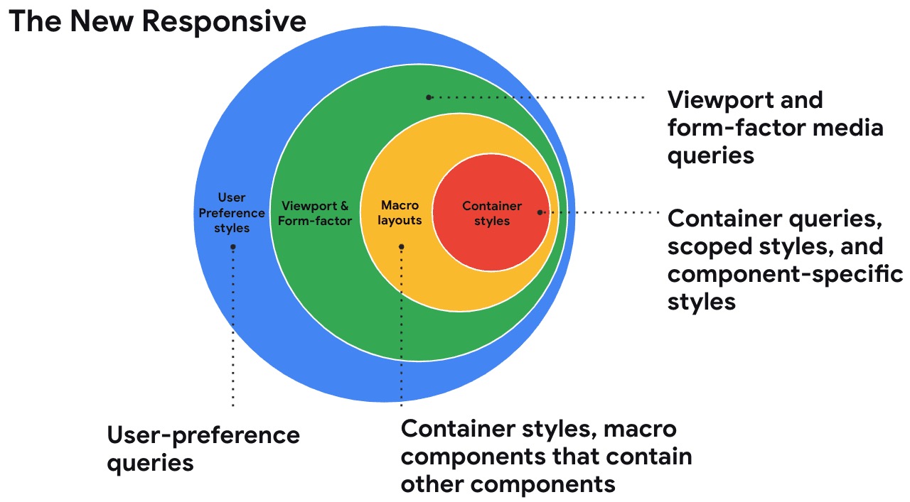
We dealt with this by adding more breakpoints. Which helped but created a new problem: maintaining 5-6 different layout states for every component. The CSS got complicated. The design files multiplied. And every time someone added a new breakpoint, every existing component needed to be checked at that size too.
Turns out there was a better approach the whole time. We just didn't have the CSS tools to implement it properly.
Container Queries Changed the Game
Container queries are now supported in 93.92% of browsers. That's basically universal. And they represent the single biggest shift in responsive design since media queries were introduced.
The core concept is simple but its implications are huge: instead of components responding to the viewport width, they respond to the width of their parent container.
Why does this matter so much? Because components don't live in viewports. They live in containers. A card component might appear in a full-width grid on one page and in a narrow sidebar on another. With media queries, it had to somehow know which context it was in. With container queries, it just responds to however much space it actually has.

The Practical Impact
Before container queries, I'd get questions like this all the time:
"The card component looks weird in the sidebar. Can you make a sidebar variant?"
And we'd create Card and CardCompact and maybe CardSidebar. Three components doing essentially the same thing at different sizes. Multiply that across your entire design system and you've got a maintenance nightmare.
With container queries, it's one component. One component that knows how to present itself at any size. Put it in a 400px container and it stacks vertically. Put it in a 700px container and it goes horizontal. The component owns its responsive behavior. No variants needed.
.card-container {
  container-type: inline-size;
}

.card {
  display: grid;
  gap: 1rem;
}

@container (min-width: 500px) {
  .card {
    grid-template-columns: 200px 1fr;
  }
}
That's it. The card switches from vertical to horizontal when its container is wide enough. Not when the viewport is wide enough. The container. This distinction matters enormously for component-based design systems.
Container Queries in Production
LogRocket published a really thorough analysis of container queries in 2026 that I think everyone should read. Their key finding: container queries are powerful but not a silver bullet. You still need media queries for page-level layout changes. Container queries handle component-level responsiveness.
The teams using container queries most effectively treat them as complementary to media queries:
- Media queries for page layout (sidebar visibility, navigation mode, column count)
- Container queries for component adaptation (card layout, form field arrangement, image sizing)
This separation makes your CSS much cleaner because each layer handles its own responsibility. Page layout doesn't care about component internals. Components don't care about page layout.
Fluid Typography: The End of Font Size Breakpoints
Remember writing CSS like this?
h1 { font-size: 24px; }

@media (min-width: 768px) {
  h1 { font-size: 32px; }
}

@media (min-width: 1200px) {
  h1 { font-size: 48px; }
}
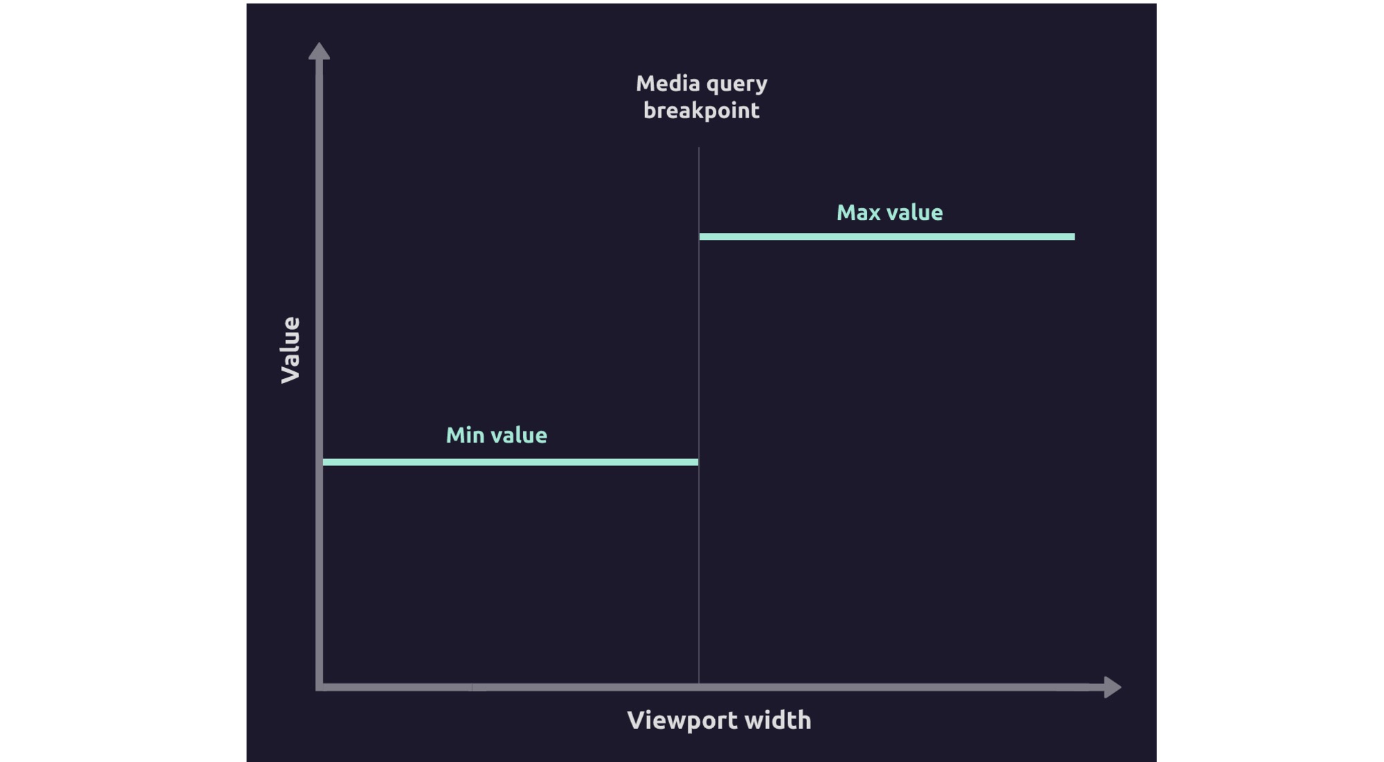
Three discrete sizes. Two jumps. At 767px your heading is 24px. At 768px it jumps to 32px. That sudden change was always jarring if you actually resized your browser slowly. Nobody designs for the resize experience, but users on foldable devices see it constantly when they fold and unfold.
The clamp() function killed this entire pattern.
h1 { font-size: clamp(1.5rem, 1rem + 2.5vw, 3rem); }
One line. The font scales smoothly from 24px to 48px based on the viewport width. No breakpoints. No jumps. Just a continuous, smooth scaling curve.
Building a Fluid Type Scale
Here's the approach I've been using and recommending to every team I work with. You define your type scale using clamp() for every size:
- Body:
clamp(1rem, 0.95rem + 0.25vw, 1.125rem)(16px to 18px) - H4:
clamp(1.125rem, 1rem + 0.5vw, 1.25rem)(18px to 20px) - H3:
clamp(1.25rem, 1rem + 1vw, 1.5rem)(20px to 24px) - H2:
clamp(1.5rem, 1rem + 2vw, 2.25rem)(24px to 36px) - H1:
clamp(2rem, 1rem + 3vw, 3rem)(32px to 48px) - Display:
clamp(2.5rem, 1rem + 5vw, 4.5rem)(40px to 72px)
The math doesn't need to be complicated. The pattern is: minimum size, a calculation involving viewport units, maximum size. The middle value controls how aggressively the font scales with the viewport.
There are online calculators that generate these values for you. Utopia's fluid type calculator is probably the most popular. You plug in your min and max viewport sizes, your min and max font sizes, and it generates the clamp() values. Takes about 30 seconds.
Fluid Typography With Container Query Units
And here's where it gets really interesting. You can use container query units (cqw) instead of viewport units (vw) in your clamp() functions. This means your typography responds to the container size, not the viewport.
.card {
  container-type: inline-size;
}

.card h2 {
  font-size: clamp(1rem, 0.5rem + 3cqw, 1.5rem);
}
The card's heading scales with the card's width. In a narrow sidebar, the heading is smaller. In a wide content area, it's bigger. Automatically. No variants, no overrides, no breakpoints.
I think this is probably the most powerful CSS technique that almost nobody is using yet. It's supported in all major browsers as of early 2026. Go use it.
Fluid Spacing: The Missing Piece
Typography gets all the attention, but fluid spacing is equally important. And it follows the exact same clamp() pattern.
Instead of fixed spacing values or breakpoint-based overrides:
:root {
  --space-xs: clamp(0.25rem, 0.2rem + 0.25vw, 0.5rem);
  --space-sm: clamp(0.5rem, 0.4rem + 0.5vw, 0.75rem);
  --space-md: clamp(0.75rem, 0.5rem + 1vw, 1.5rem);
  --space-lg: clamp(1rem, 0.5rem + 2vw, 2.5rem);
  --space-xl: clamp(1.5rem, 0.5rem + 4vw, 4rem);
  --space-2xl: clamp(2rem, 0.5rem + 6vw, 6rem);
}
These spacing values scale smoothly with the viewport. Section padding gets tighter on mobile and more generous on desktop. Card padding adjusts automatically. Gaps between grid items respond to available space.

The beauty of this approach is that you define your spacing scale once and it just works everywhere. No more padding: 16px on mobile and padding: 48px on desktop with a media query in between. The values flow naturally.
Combining Fluid Spacing With Container Queries
Same trick as typography. Use cqw units in your clamp() values for spacing that responds to container size:
.card {
  container-type: inline-size;
  padding: clamp(0.75rem, 0.5rem + 2cqw, 2rem);
  gap: clamp(0.5rem, 0.25rem + 1.5cqw, 1.5rem);
}
The card's internal spacing adapts to how much room the card has. Tight when it's in a narrow sidebar, generous when it's in a wide content area. One set of values. Zero breakpoints.
Intrinsic Web Design: Letting the Content Decide
Jen Simmons coined the term "intrinsic web design" years ago, and in 2026 it's finally the mainstream approach. The core idea: let the content itself determine the layout, not a predetermined grid structure.
CSS Grid's auto-fit and minmax()
This one pattern replaces probably 60% of the responsive grid code I used to write:
.grid {
  display: grid;
  grid-template-columns: repeat(auto-fit, minmax(min(300px, 100%), 1fr));
  gap: var(--space-md);
}
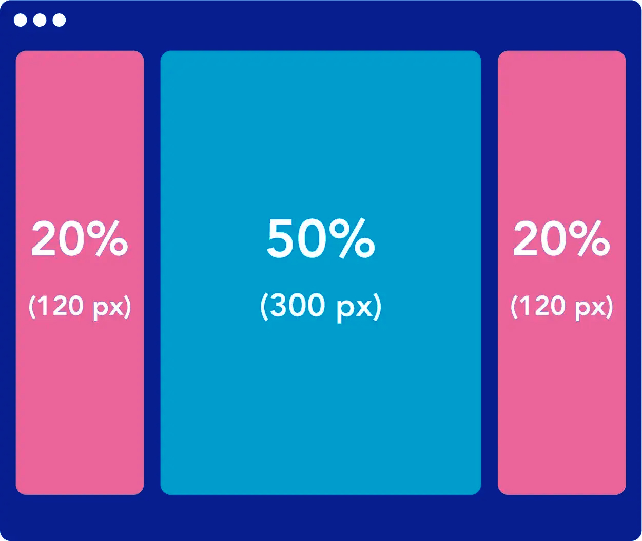
This creates a grid where:
- Each column is at least 300px wide (or 100% on very small screens)
- Columns automatically wrap when they can't fit
- Available space is distributed evenly
No media queries. No breakpoints. The grid just figures it out based on available space and content requirements.
Flexbox With flex-wrap and min-width
For simpler layouts, this pattern is gold:
.layout {
  display: flex;
  flex-wrap: wrap;
  gap: var(--space-md);
}

.layout > * {
  flex: 1 1 300px;
}
Each item wants to be at least 300px wide but will grow to fill available space. When items can't fit side by side, they wrap. Simple. Effective. Zero media queries.
The min(), max(), and clamp() Trinity
These three functions are the building blocks of intrinsic design:
min()picks the smaller of two values.width: min(600px, 100%)means "600px or the full width, whichever is smaller." Perfect for constraining content.max()picks the larger value.margin-inline: max(1rem, 5vw)means "at least 1rem of margin, more on wider screens."clamp()combines both.width: clamp(300px, 50%, 800px)means "between 300px and 800px, preferring 50% of the container."
Turns out you can build incredibly responsive layouts with just these functions and some flexbox or grid. No breakpoints at all.
What This Means for the Design-Development Handoff
The shift to fluid design fundamentally changes how designers and developers communicate. And honestly, the handoff process in most organizations hasn't caught up yet.
The Old Way
- Designer creates mockups at fixed widths
- Developer receives mockups and implements with breakpoints
- Designer reviews at those fixed widths
- "Looks good" at review widths, weird everywhere else
The New Way
- Designer defines ranges and relationships, not fixed positions
- "This heading should be between 24px and 48px, scaling with the viewport"
- "These cards should be at least 280px wide, wrapping automatically"
- "Section padding should increase proportionally on larger screens"
This is a genuinely hard transition for designers used to pixel-level control. I get it. There's a comfort in knowing exactly where every element sits. But that certainty was always an illusion. The user's screen is not your Figma canvas.
Figma's Role in Fluid Design
Figma has made progress here with auto layout, min/max constraints, and responsive components. But I'll be honest: Figma is still fundamentally a fixed-canvas tool. You can simulate fluid behavior to some degree, but you can't truly design a clamp() value in Figma. You can show what it looks like at various sizes, but the fluid transition between sizes can't be represented in a static design tool.
This is where prototyping tools and browser-based design are getting more important. Some teams have started designing directly in the browser using tools like Webflow or even hand-coded HTML/CSS prototypes. The design IS the responsive behavior, not a static representation of it.
Practical Migration: Going Fluid Without Rewriting Everything
If you're sitting on a codebase with dozens of media queries, you don't need to rewrite everything at once. Here's a practical migration path.
Phase 1: Fluid Typography (1-2 days)
Replace all your font-size media queries with clamp() values. This is the highest-impact, lowest-risk change. Typography doesn't affect layout (much), so the risk of breaking things is minimal.
Before:
.title { font-size: 24px; }
@media (min-width: 768px) { .title { font-size: 36px; } }
@media (min-width: 1200px) { .title { font-size: 48px; } }
After:
.title { font-size: clamp(1.5rem, 1rem + 2.5vw, 3rem); }
Phase 2: Fluid Spacing (1-2 days)
Create a set of fluid spacing custom properties and start using them. Replace hardcoded padding and margin values with your fluid tokens.
This is slightly more risky because spacing changes can affect layout. Go section by section, test as you go.
Phase 3: Intrinsic Grids (ongoing)
Gradually replace media-query-based grid changes with auto-fit/minmax() patterns. This is the most impactful change but also the most visible. Do one grid at a time, QA thoroughly.
Phase 4: Container Queries (ongoing)
Identify components that appear in multiple contexts (cards, forms, navigation items). Refactor them to use container queries for their responsive behavior. This requires adding container-type to parent elements.
The Performance Angle
Fluid design isn't just about aesthetics or developer convenience. There are real performance implications.
Less CSS
A component that uses clamp() and container queries instead of media queries generates significantly less CSS. I measured one of our component libraries: the fluid version was 23% smaller in total CSS output. Fewer media queries means fewer selector repetitions.
Fewer Layout Recalculations
When the browser encounters a media query breakpoint during resize, it needs to recalculate the layout. Fluid values change continuously without triggering the same kind of layout recalculation cascade. This makes resize behavior smoother, which matters for foldable devices and window management.
Reduced JavaScript
Many responsive behaviors that used to require JavaScript (resize observers, breakpoint detection, conditional rendering) become pure CSS with container queries and fluid values. Less JavaScript means faster initial load, less memory usage, and fewer potential bugs.
Common Mistakes I Keep Seeing
Even teams that have embraced fluid design make some consistent mistakes. Here's what to watch out for:
Forgetting Minimum and Maximum Bounds
font-size: calc(1rem + 2vw) looks fine at normal viewport sizes. But at 4K resolution, your body text is 40px. And at 320px viewport, it might be too small to read. Always use clamp() with sensible minimums and maximums.
Making Everything Fluid
Not everything should scale. A border that's 1px should stay 1px. An icon at 24px should probably stay 24px (or use discrete sizes: 16, 20, 24, 32). Border radius usually works better as fixed values too. Fluid design is for layout, typography, and spacing. Not for every single CSS value.
Ignoring the Content
Fluid grids work best when the content within them is also fluid. A grid with auto-fit and minmax(300px, 1fr) looks weird if the content inside each cell has fixed widths that don't adapt. Fluid layouts need fluid content.
Using Too-Aggressive Scaling
I see this a lot with typography. font-size: clamp(1rem, 5vw, 3rem) creates text that scales way too aggressively. At 600px viewport width, 5vw is 30px. That's massive for body text. Keep your viewport unit multipliers reasonable. For body text, something like 0.25vw to 0.5vw is usually enough.
The Elephant in the Room: Designers Who Hate This
I'm not going to pretend this is universally loved. Some designers genuinely hate losing pixel-level control. And their concerns aren't invalid.
When a designer says "I want this heading to be exactly 48px on desktop," they have a reason. They've considered the visual weight relative to other elements. They've checked the rhythm of the type scale. They've ensured the line length is comfortable at that size.
Fluid design asks them to give up that precision and trust that a mathematical formula will produce acceptable results across a continuous range of sizes. That requires a different kind of design thinking. Not "what does this look like at 1440px?" but "what are the acceptable ranges for this value, and how should it scale?"
Some designers adapt quickly. Others struggle with it. If your team is resisting the fluid approach, don't force it. Start with the easy wins (fluid typography, intrinsic grids) and let people see the benefits before pushing for full adoption.
What's Coming Next
A few things I'm watching that will push fluid design even further:
Container style queries are probably landing in stable browsers this year. These let you query not just the size of a container but its computed style values. You could have a card that adjusts its layout based on whether its container has a dark or light background. Or a component that responds to its parent's font-size.
Anchor positioning is going to change how we handle overlays, tooltips, and dropdown menus. No more JavaScript positioning libraries. CSS will handle it natively, with fluid positioning that responds to available space.
The :has() selector is already widely supported, and combined with container queries, it enables component layouts that respond to their own content. A card with an image lays out differently than a card without one. Pure CSS.
These tools keep pushing us toward layouts that are truly content-aware and context-responsive. The destination is a web where every component adapts intelligently to its environment without a single media query or line of JavaScript.

And that world is surprisingly close. Most of the CSS tools we need are already here. The shift now is in how we think about design. Not as fixed compositions, but as fluid systems that respond to their environment.
It's a better model. More resilient. More maintainable. More aligned with how people actually use the web. Pixel-perfect had a good run. But the web was never meant to be a print medium, and it's kind of a relief that we finally stopped pretending it was.